

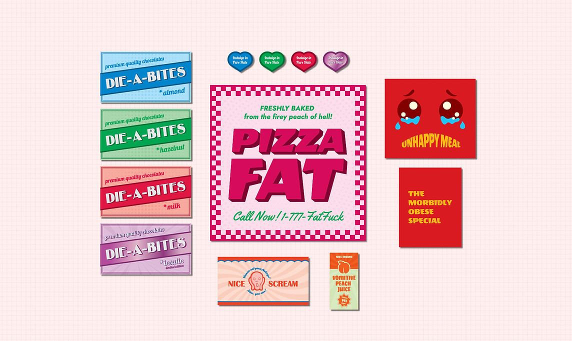
Fat F*ck! - Prop Stickers
A friend of mine asked for help in creating the music video for his song "Fat F*ck!", which is about his childhood struggles with food. My job was to design a set of satirical prop stickers that feel real at first glance but reveal a darkly comedic twist, aligning with the song’s rebellious tone.
DATE: 2024
TYPE: Client Project
DESIGN AREA: Prop Design
TOOLS: Adobe Photoshop, Adobe Illustrator


Inspiration
I drew inspiration from 1950s and 60s fast food packaging, retro typography, and cheerful slogans that made processed food feel exciting and fun. I wanted the stickers to be colorful and eye-catching, resembling something you would actually find on a snack wrapper.

Design Choices
Layout
I followed classic fast food branding principles—big, central text, dynamic angles, and subtle textures—to make the designs feel familiar but slightly over-the-top.
Typography
The fonts are a mix of chunky, retro-inspired lettering and playful script, combining that nostalgic fast food aesthetic with an exaggerated, almost cartoonish feel.
Color
I chose bold, high-contrast colors to mimic the bright, appealing look of real junk food packaging, but increased the saturation to create a slightly surreal effect.
Challenges
The biggest challenge was nailing the balance between parody and realism. I wanted these to look like legit food labels at first glance, only for the joke to hit once you read them. Making sure the humor landed without feeling too forced was another key challenge, especially with the wordplay. I also had to keep everything cohesive across different product types while letting each one have its own distinct personality.


